Funny Bone Branding
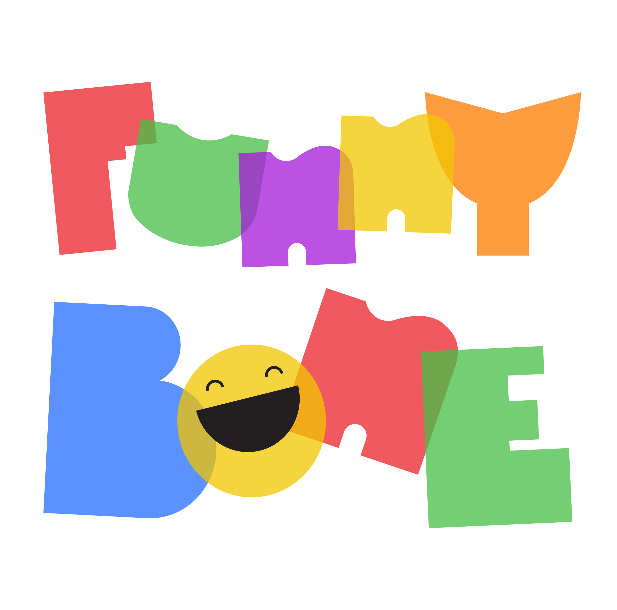
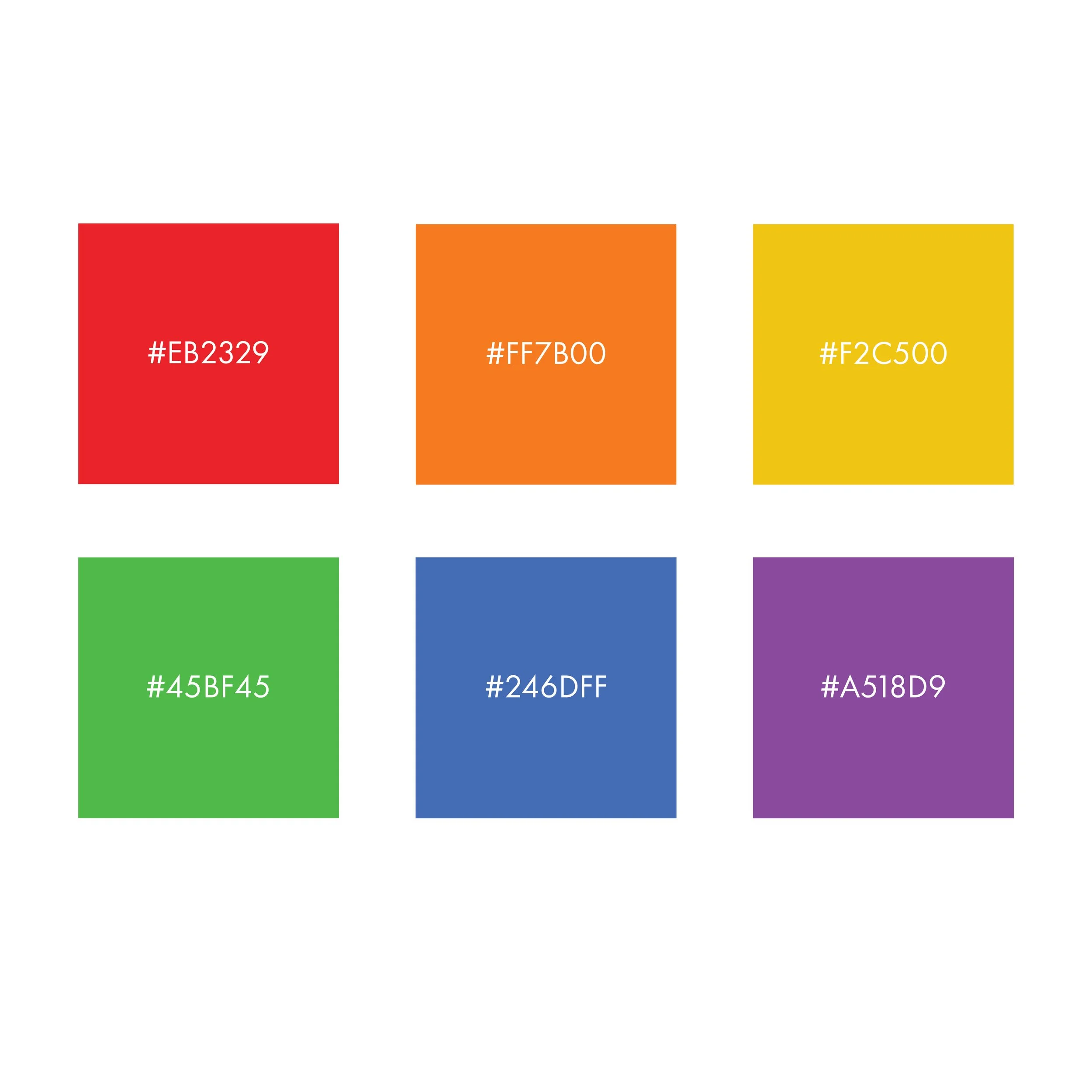
Branding for a proposed education app for young children. App uses humor to teach kids about kindergarten fundamentals. The goal was to create a brand that looks kid-friendly but is also sophisticated enough for parents 35 and under to notice. The company is big on platonic forms, simple shapes, and primary and secondary colors.
More than just a logo
It is important that your brand goes beyond just a logo. I created a system for Funny Bone to promote their app across all forms of communication.
-
I started this project by researching my target audiences. Children ages 3-6 and parents 35 and under. From there I created a moodboard with inspiration for typography, color, and illustration, as well as images of existing competitive landscape and brandmarks I liked.
-
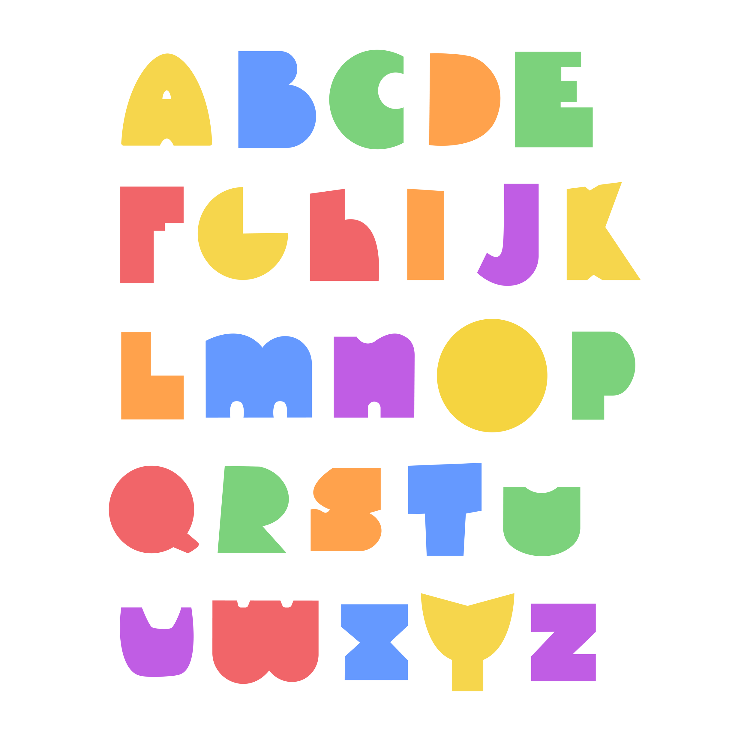
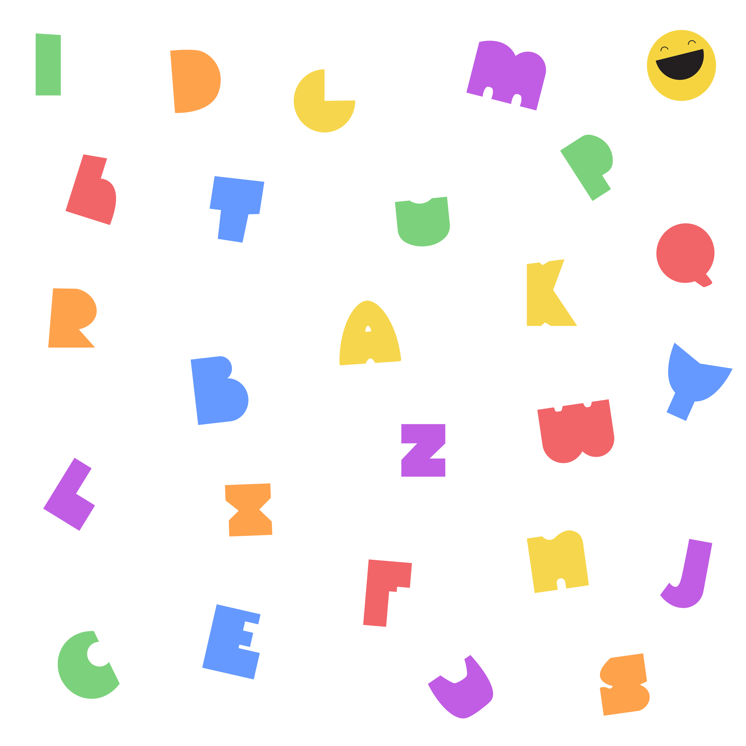
Early on I knew I wanted to create characters that would interact with the users. I started experimenting wih shapes and faces but ultimately wanted to keep logo more typographic. I decided that I could create characters out of the letters.
-
The “face” of the brand is the big smiley letter O in Funny Bone. This character works on his own as a brandmark or in the wordmark. The branding is fun and exciting for kids, even if they can’t read the words yet. For parents, the branding is simple and emphasizes the subjects their child will learn in the app, such as reading, spelling, math (geometry,) and colors.


